 "Pickup_man" (zekeh)
10/13/2016 at 17:10 • Filed to: None
 12
12
 20
20
 "Pickup_man" (zekeh)
10/13/2016 at 17:10 • Filed to: None |  12 12
|  20 20 |
Every time the new Ram or Ford lettering tailgates show up there are a slew of comments about how it they are extremely tacky, and ugly. However, pickup manufactures have been pressing their name in the tailgate since the beginning of pickups. So why are these ugly?
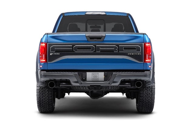
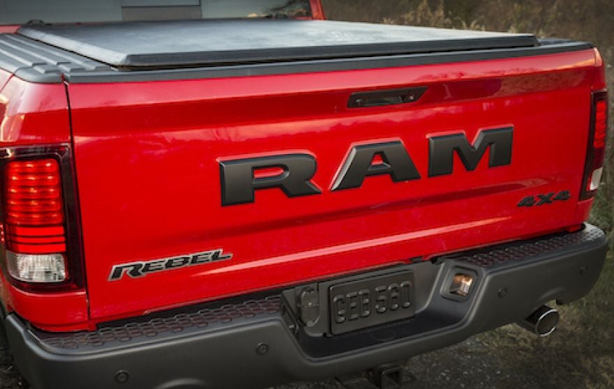
But these are cool?
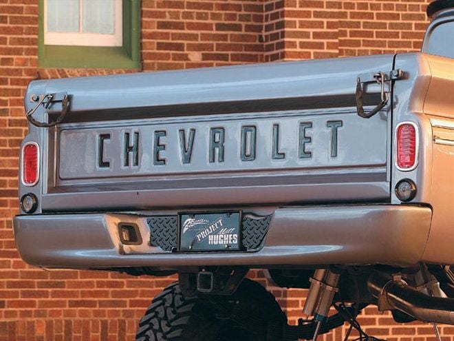
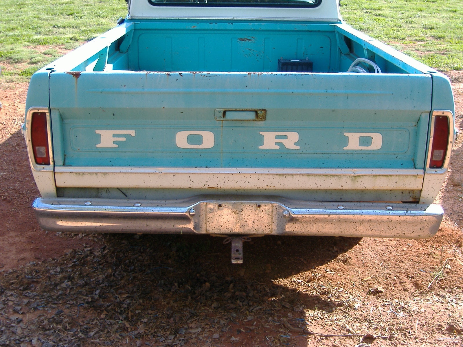
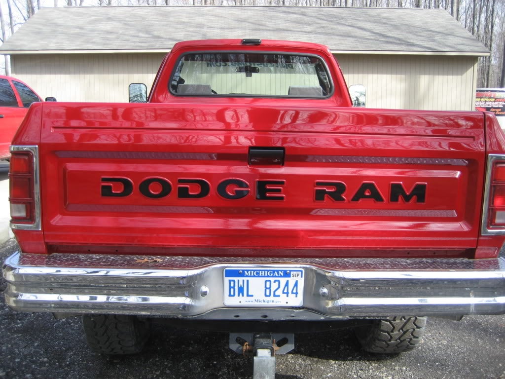

I’ll tell you why.
There are several key factors as to why old lettering gates are cooler than the new ones.
- Nearly always the lettering was located within some sort of recess in the tailgate itself. This recess adds a lot of character and style to a tailgate. It adds depth, and a subtle focal point drawing your eye’s to the lettering, without the lettering being over bearing. The newer tailgates all bulge outward, likely in an attempt to appear muscular (there are also some aero benefits though).
- If the lettering wasn’t within a recessed area, but on a flat surface, or completely flat tailgate, they were normally pressed in not out. Ex.
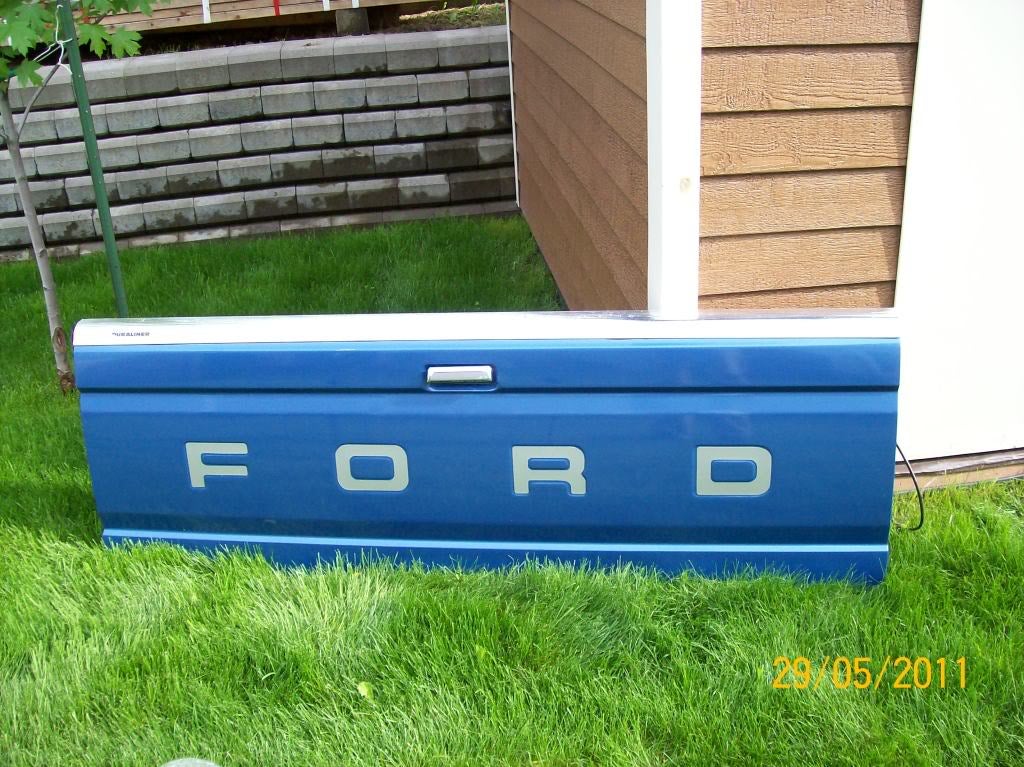
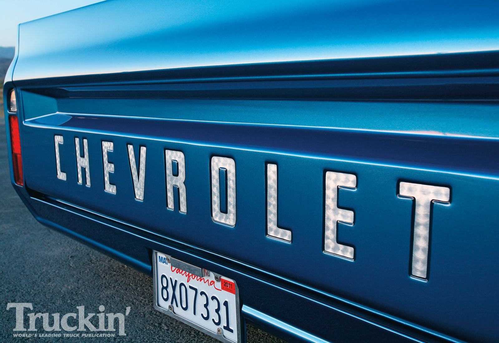
And even still there are recessed areas or lines to simulate recessed areas. Not so on newer tailgates. Once again, the new tailgates are all pressed (or molded in this age of fantastic plastic) outward.
-Shallow stamping. Compared to the two newer tailgates, the stamping on the older gates is much shallower making the lettering much more subtle, yet still an obvious focal point. Newer tailgates seem to be over compensating, again in an attempt to appear more muscular.
-Badge overload. Now days manufactures want everyone to know exactly what you have and they do this by placing many badges on the tailgate. RAM! REBEL! 4x4!!!! FORD! F-150! RAPTOR!!!!! No one is going to confuse your macho man Rebel with a puny base model V6. Older trucks? Just one, usually nothing more than the company name smack dab in the middle of the gate. No one needed to know that you’re driving the Chevrolet K20 Crew Cab 4x4 454 Silverado Ranch Edition every time they come up behind you. Those badges are elsewhere, sure, but they’re still small and subtle, all they needed to know was that this hard working piece of machinery in front of them is a Ford/Dodge/Chevy/International/GMC/etc. etc. etc. Having multiple logos on a tailgate isn’t a new thing. Multiple badges seemed to gain popularity in the late 90's, but even then they were smaller badges, usually placed in the lower corners of the tailgate, with maybe an appropriately sized logo in the center of the tailgate. It’s only when you combine the large lettering with the other logos does it become too much.
-We went away from it for a while. Again, sometime in the 90's most large lettering tailgates went away. I don’t know why, but they did. That was roughly twenty years ago so we’ve had twenty years to get used to a new standard in tailgate styling. Even though large lettering tailgates aren’t new, they’re a big change from what we’ve gotten used to. People don’t like change.
So there you have it, my analysis as to why newer lettering tailgates are generally regarded as ugly, while older ones are considered cool. And you know these are all scientifically legitimate reasons, because I am the Pickup Man, foremost expert in all things pickup*.
* Full disclosure, I’m am not foremost, nor an expert, I am simply a guy infatuated with pickups constantly trying to learn as much as I can about all types of pickups, and who inspires to own the worlds largest collection of pickups someday**
**Not likely to happen, but I can dream.
 For Sweden
> Pickup_man
10/13/2016 at 17:18 |
|
Tailgateisitelock
 RamblinRover Luxury-Yacht
> Pickup_man
10/13/2016 at 17:23 |
|
I think there’s also a letter size tipover point that compounds the indented/”popped” problem. Up to about a 4" tall letter, it’s not eating the entire tailgate. It’s also true that the elegance of the letters has something to do with it. “F O R D” gets across its point,
FORD
in massive stylized letters with accent marks and bulking up... not so much.
 Probenja
> Pickup_man
10/13/2016 at 17:31 |
|
I think that they tried to make the font too wide where the old cars had a more narrow font. It’s like the new trucks have the CAPS LOCK ON all the time.
 PanchoVilleneuve ST
> Pickup_man
10/13/2016 at 17:33 |
|
That F O R D grille you can get on the Raptor is cool as hell, though.
 Alfalfa
> Pickup_man
10/13/2016 at 17:41 |
|
I’d say you’ve pretty much nailed it.
 Bourbon&JellyBeans
> Pickup_man
10/13/2016 at 17:43 |
|
Welp, they’re plastic! When has the addition of plastic ever done anything for automotive design?
 Pickup_man
> PanchoVilleneuve ST
10/13/2016 at 17:46 |
|
It’s definitely better on the new Raptor than the old one IMO.
 Pickup_man
> Bourbon&JellyBeans
10/13/2016 at 17:46 |
|
Pretty much never.
 CalzoneGolem
> Pickup_man
10/13/2016 at 17:55 |
|
I think the new ones are also cool.
 CalzoneGolem
> Pickup_man
10/13/2016 at 17:55 |
|
*cough* Pontiac *cough*
 Noah - Now with more boost.
> Pickup_man
10/13/2016 at 18:40 |
|
Great post. Auto journalism needs more in depth analysis of design; everyone just recycles the same few adjectives. I’d add that the new style looks tacky because it’s also trying *really* hard to be macho. That’s the demographic they’re going for now, and I don’t think that was the case back in the day. Conversely, old school lettering was just an aesthetically pleasing solution to a simple pair of problems: They needed a way to put the brand on the back of the truck somehow, and some lettering was a great way to fill in negative space on the tailgate.
 JCAlan
> Pickup_man
10/13/2016 at 18:42 |
|
Dead on. Embossed lettering built into the design of the tailgate versus stuck on plastic.
 jasmits
> Pickup_man
10/13/2016 at 19:38 |
|
The old ones are just good functional design, the new ones are overdone. I’m picturing the RAM pressed in with a slightly less obnoxious font and I think it would really add to the look of the truck. Same with the FORD.
 shop-teacher
> Pickup_man
10/13/2016 at 21:10 |
|
I seriously miss the recessed areas in tailgates. Those and plaid bench seats seriously need to make a comeback.
 Pickup_man
> jasmits
10/13/2016 at 23:09 |
|
I agree, reverse the lettering, and size it down a little and it would probably look pretty good.
 Pickup_man
> shop-teacher
10/13/2016 at 23:38 |
|
I wasn’t alive during the time of recessed tailgates, but I would love to see them comeback as well. And the world could always use more plaid and bench seat.
 RamblinRover Luxury-Yacht
> Noah - Now with more boost.
10/14/2016 at 08:15 |
|
Old school lettering even serves third (when embossed) and fourth purposes - stiffening the gate somewhat and hiding distortion or dents in the gate by breaking up the lines.
 Somethin' 'bout a truck
> Pickup_man
11/16/2016 at 13:52 |
|
First. Your name is a solid choice.
Second. I can’t stand the new lettering. But I expect it out of the newer trucks. It’s cheap to add the letters on top of the tailgate but I think it looks awful. Toyota is doing currently doing a great job letter pressing the truck name in the tailgate.
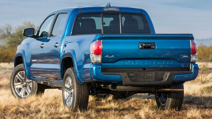
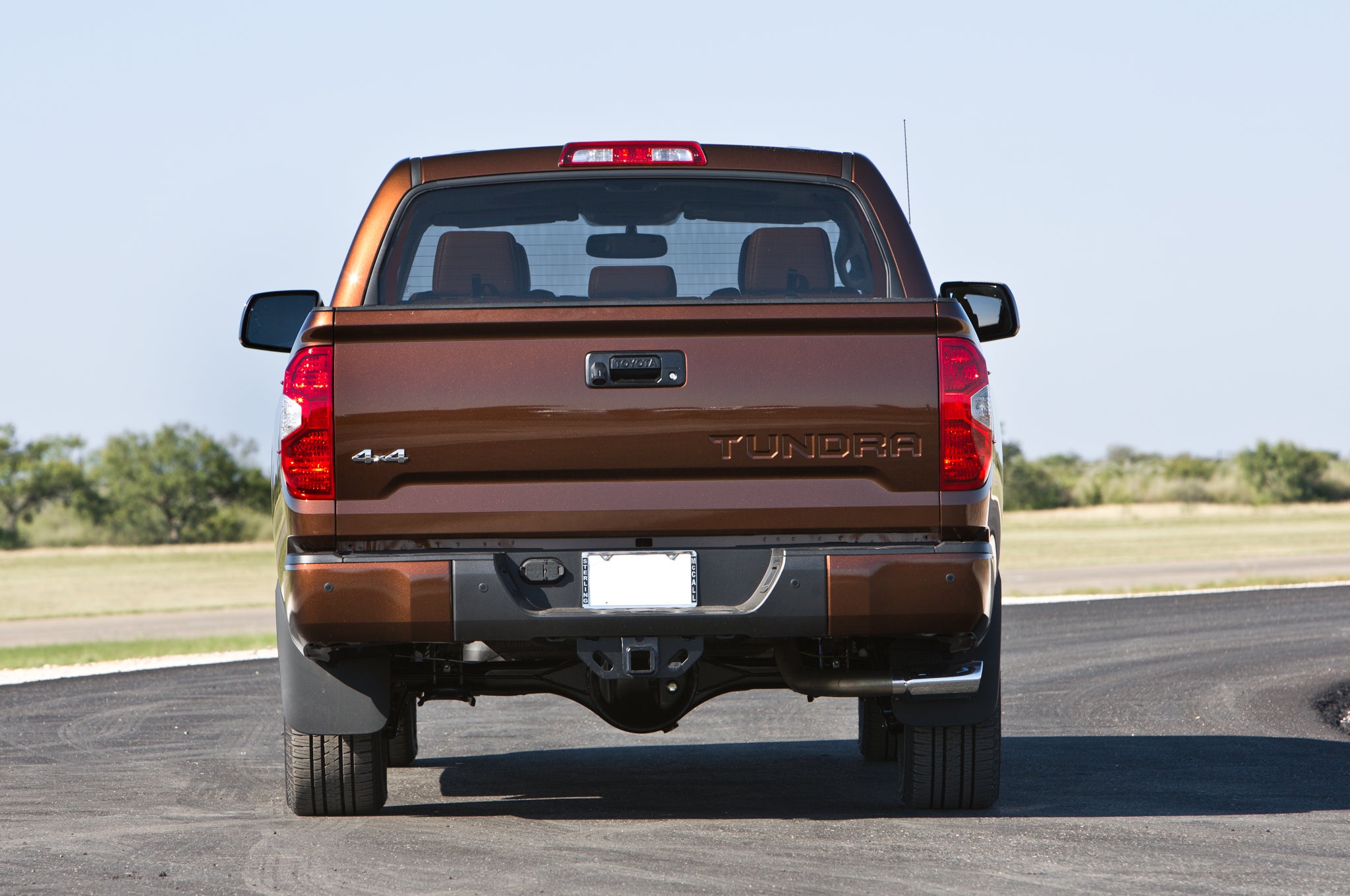
I like the centered look with the Tacoma, but the Tundra is still far better than anything we can find on a “domestic” truck.
 Somethin' 'bout a truck
> PanchoVilleneuve ST
11/16/2016 at 13:53 |
|
No question!!
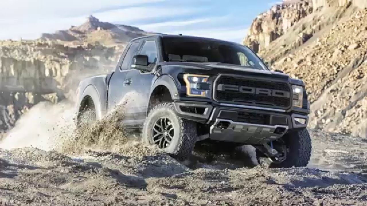
For reference.
 Somethin' 'bout a truck
> Noah - Now with more boost.
11/16/2016 at 13:54 |
|
Every journalist should have called out RAM on the awful tailgate letters. But because they didn’t I think it’s just a cop out so they don’t get denied early test drives..